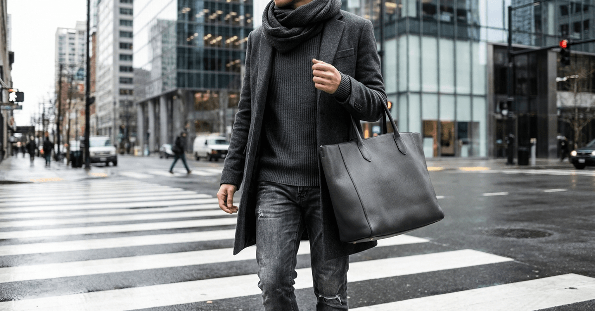
An all-black outfit built from three cotton pieces looks like you ran out of options. Same color, same fabric, same flat result.
The difference between “monochrome that works” and “monochrome that looks like pajamas” comes down to one variable: the surface of each piece. Swap one fabric for a different one, and the whole outfit changes character.
Most style advice tells you to mix tones. A lighter grey here, a darker grey there. I think that advice leads people straight into looking like mismatched laundry, and I’d rather see someone commit to one exact shade across three different textures than chase a tonal gradient that rarely lands right.
This piece is for city dwellers who already own 15 black or grey items and need those pieces to stop reading like a uniform.
Why Monochrome Goes Wrong Without Texture
A single-color outfit collapses visually when every piece shares the same material. Three items in navy cotton jersey merge into one shapeless block. The eye has nothing to grab onto, nothing to separate the jacket from the shirt from the pants.
Texture breaks that merge. A suede jacket over a cotton tee tucked into denim jeans, all in navy, reads as three distinct layers.
The matte pull of suede, the soft drape of cotton, the rigid weave of denim: each surface catches light differently. That difference is what creates depth.
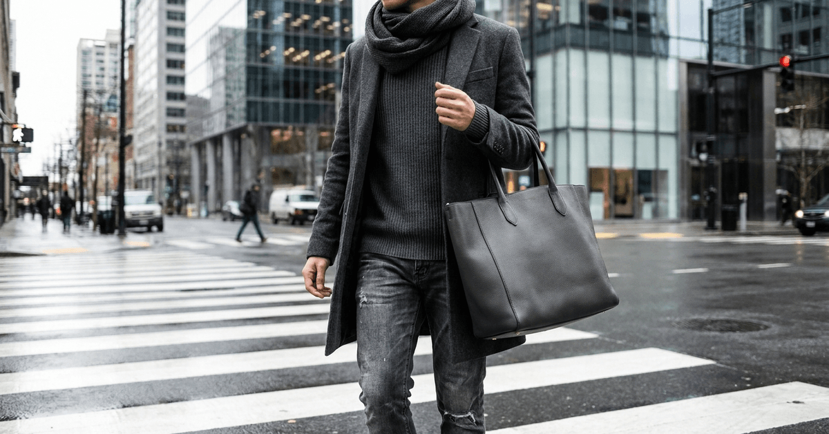
How Fabric Surface Creates Depth in Single-Color Looks
Light behaves differently on every material. Silk reflects it. Wool absorbs it. Denim scatters it along its weave. A monochrome outfit that mixes these surfaces gives the eye a reason to travel across the body instead of glazing over it.
This is also why all-black outfits photograph so differently depending on the fabrics involved. A matte wool coat over a satin turtleneck paired with leather boots creates three separate planes of black, each at a different brightness level. The color stays the same. The visual effect changes completely.
And there’s a practical angle, too. Materials like wool and fleece add warmth for cool rooftop evenings, while linen and silk stay breathable on a July subway platform. Texture choices pull double duty: they shape both the look and the comfort of an outfit.
Textures That Work for Urban Wardrobes
Not every fabric belongs in every city. A chunky cable-knit scarf that looks right on a street in Warsaw would be miserable in Singapore. One mistake I see repeated on every fashion blog is treating texture recommendations as universal.
Climate dictates texture more than aesthetics do, and picking fabrics for looks rather than weather is the fastest route to a closet full of things you never wear.
That said, some textures hold up across most urban settings because they perform well in a range of temperatures and wear patterns.
Fabrics Worth Keeping in a City Closet
A working city wardrobe can rely on a smaller set of textures than most people assume. The ones that earn their space do so because they layer well, breathe reasonably, and age without falling apart after two subway commutes.
- Denim holds structure and works year-round in jeans, jackets, and shirts. It also fades in ways that add visual interest over time.
- Leather shifts the tone of any outfit instantly. A leather belt, boots, or jacket adds a different sheen that pulls away from softer fabrics around it.
- Cotton and linen are the breathable base layers. Matte finish, low shine, easy to layer under heavier textures without overheating.
- Knitwear brings tactile contrast: chunky sweaters, ribbed socks, and knit beanies feel different from woven fabrics and catch light on their ridges.
- Silk and satin introduce reflective shine in small doses. A silk scarf or satin lining inside a jacket adds an unexpected surface without overwhelming the outfit.
- Suede and velvet work best in cooler months. Boots, hats, or bags in these materials carry a soft density that heavier fabrics like wool can’t replicate.
How to Build a Monochrome Outfit Step by Step
Outfit planning matters more when every piece shares one color. A mismatch in tone or a texture clash can turn the whole thing sloppy fast. The process that works best is simple, and it starts with picking the color before touching a single garment.
- Pick a base color like charcoal, olive, or camel. Consider what suits your city: darker shades for concrete-heavy places like New York, earth tones for warmer-toned cities like Lisbon.
- Choose three clothing items in that color, each from a different fabric. A wool sweater, cotton chinos, and suede boots in olive, for example.
- Add one texture-contrasting layer: a quilted vest over a cotton shirt, or a glossy raincoat picked up at a vintage market.
- Finish with subtle accessories in the same color family: ribbed socks, a corduroy cap, a woven belt.
- Check the final combination in natural daylight before leaving. Indoor lighting flattens texture contrast, and what looks like three distinct surfaces under a lamp can merge into one block outside.
Apps like Smart Closet help track which fabrics and colors are already in rotation. Logging successful combinations saves time on mornings when decision fatigue hits hard.
Matching Textures to Your City’s Climate
The raw material of your city’s weather should shape your texture palette. A velvet blazer that earns compliments in Montreal becomes a sweat trap in Miami.
Climate-appropriate texture mixing is the difference between outfits that get worn 40 times and ones that sit in a closet after two attempts.
| Climate Type | Cities | Best Textures | Avoid |
|---|---|---|---|
| Rainy and cool | London, Amsterdam, Seattle | Waxed cotton, water-resistant synthetics, rubber-grip accessories | Suede, untreated leather, open-weave knits |
| Hot and humid | Singapore, Miami, Madrid | Linen, Tencel, lightweight denim, mesh sneakers | Velvet, heavy wool, layered knitwear |
| Cold and dry | Warsaw, Zurich, Montreal | Tweed, felted wool, cable-knit scarves, ribbed wool hats | Thin linen, unlined silk, single-layer cotton |
The takeaway: if a texture can’t survive your commute in comfort, it doesn’t belong in your monochrome rotation no matter how good it looks on a hanger.
Mistakes That Flatten Monochrome Looks
Getting monochrome right is mostly about avoiding a few specific errors that undo all the texture work. These come up constantly, and they’re worth naming directly.
Too Much Uniformity in Shade
Wearing every item in the exact same shade, with zero variation, can look unfinished rather than intentional.
A small shift in tone, like mixing charcoal with a slightly lighter grey, often reads more relaxed. I’d keep the tonal range tight though. Two closely related shades are enough.
Three or four shades of grey starts to look accidental, which is why I push back on the “tonal variation” advice that most style guides repeat without questioning.
Sticking to one shade and rotating textures produces a cleaner result than chasing a gradient that rarely aligns in real life.
Ignoring Accessories
Bags, belts, and shoes are where texture contrast lands hardest. A matte canvas tote against a silk shirt, or patent leather boots under cuffed denim: these small friction points between surfaces are what separate a considered outfit from a rushed one.
Seasonal Mismatch
Velvet in peak summer fails outside of air-conditioned spaces. Linen in January works indoors but collapses the moment wind hits. Match textures to the month, not the mood board.
Real Monochrome Outfits by City and Season
Abstract advice only lands when the reader can picture the finished product. A few combinations pulled from the raw material show how texture mixing works across different weather and cities.
- Parisian winter, all black. A matte wool coat layered over a silky black turtleneck, cuffed black denim, patent leather Chelsea boots. Four textures, zero color deviation. The silk turtleneck catches light where the wool absorbs it.
- Tokyo spring, creams and off-whites. A loose linen button-up, fine-gauge knitwear pullover, canvas trousers, textured canvas tote. Lightweight layers in breathable fabrics. The knit pullover separates visually from the linen and canvas pieces around it.
- New York autumn, city grey. A heathered cashmere sweater, structured grey blazer, classic stonewashed jeans. The cashmere softness against the blazer’s sharper shoulder line creates contrast without any color shift at all.
Sometimes a rule break works, too. A stark white sneaker under an olive outfit, or a tan leather belt splitting an all-navy look: these single interruptions re-energize the palette. Urban style runs on confidence more than strict compliance.
Hunting for texture-rich secondhand pieces works well through platforms like Depop, where searching by fabric name (suede, corduroy, linen) filters faster than browsing by category. Touching fabric in person still matters when thrifting in physical stores. Labels and seams tell the truth about quality faster than photos.
Questions People Ask About Monochromatic Outfits and Texture
A few of the most common questions around monochrome styling come up repeatedly, and the answers are shorter than most people expect.
- Q: How many textures should one monochrome outfit include?
Three is the sweet spot. Two textures can still feel flat, and four or more can start competing for attention. A base fabric, one contrasting layer, and one accessory texture covers most situations without overcomplicating the outfit. - Q: Does monochrome dressing save money?
It can, because pieces in the same color family mix more freely than a wardrobe built on pattern and color diversity. A new suede jacket in black works with every other black item already in the closet. That interchangeability stretches a smaller number of garments further. - Q: Should I match my bag and shoes in monochrome outfits?
Matching material matters more than matching shade. A suede bag and suede boots in slightly different tones still read as coordinated. A leather bag and canvas shoes in the same exact grey can look disjointed because the surfaces are fighting each other.
Conclusion
Monochrome dressing in a city becomes easier once texture replaces color as the main variable. The closet shrinks, the combinations multiply, and mornings get faster.
A single shade worn across three surfaces says more than five colors thrown together in a rush. Committing to one color and rotating fabrics is the kind of constraint that makes getting dressed feel like a creative act again.