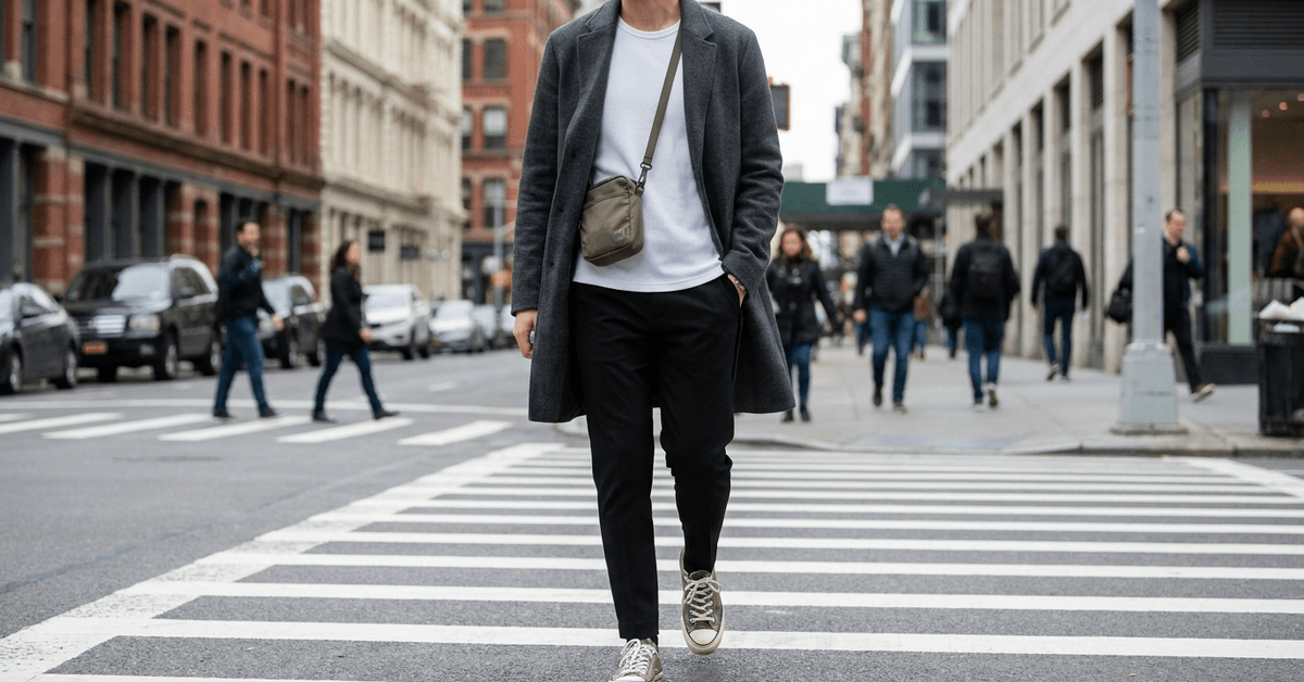
Every minimalist streetwear guide starts with the same instruction: build around black. It’s the default for a reason. Black reads urban, pairs easily, and never demands explanation.
The trouble is that black varies wildly across brands. A black tee from Uniqlo sits next to a black jacket from Arket, and under natural light, one looks charcoal while the other runs blue-dark.
This guide is for the daily commuter who needs a small rotation of pieces that mix reliably between the morning train and a Friday evening out. Fewer decisions, zero costume changes, and a look that stays sharp across daylight and bar lighting alike.
A Better Foundation Than All-Black
The base of any minimalist streetwear wardrobe comes down to five neutrals: black, white, gray, navy, and beige. That part is well-covered ground. The question nobody spends enough time on is which neutral should anchor the whole system.
I’d pick navy over black as the anchor piece for one specific reason: navy pairs cleanly with gray, white, and beige while sitting comfortably in professional settings like Frankfurt or Singapore, where commuters use the same outfit from desk to after-hours plans.
Black demands dye consistency across every brand. Navy is more forgiving.
Gray as the Connector Piece
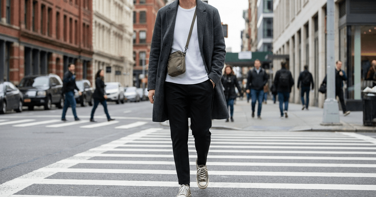
Gray does something no other neutral manages. It softens black, warms up navy, and complements beige without competing. Light heather gray or slate gray both work, depending on whether the outfit leans casual or polished.
A gray hoodie under a navy jacket is one of those combinations that looks considered. It reads “smart but not stiff,” which is the exact frequency minimalist streetwear operates on.
Beige and White for Warmth and Lift
Beige layers well in cooler months. A beige overcoat over a white tee gives the outfit brightness without loudness.
Nordic dressers in Stockholm have turned this pairing into a near-uniform: beige coat, white top, pale blue denim. The formula works because the tones sit close together on the warmth spectrum.
White, on its own, stays the single most effective reset piece. A crisp white tee resets a heavy top half or anchors a dark bottom. Copenhagen mornings and Barcelona late strolls both call for it.
The Three-Color Rule and How It Prevents Overthinking
Milan and Madrid locals tend to cap each outfit at three colors maximum. That limit does two things at once: it forces intentional pairing, and it keeps the minimalist look from drifting into a costume.
The formula is simple in theory but particular in practice.
The three slots break down like this: one dominant color for outerwear (navy, black, or gray), one lighter shade for the midlayer or top (white, beige, or light gray), and one accent for a single accessory or shoe.
Assembling a Day Outfit Using Three Colors
A navy bomber, a white tee, and olive sneakers. Or a gray overcoat, a beige knit, and white trainers.
Each version uses three tones, and each piece could rotate into the other outfit. That cross-compatibility is what makes the rule worth following.
The temptation is always to squeeze in a fourth color. Resist it. The moment a bold scarf appears on top of an already three-tone outfit, the whole look loses its quiet authority.
Switching a Day Look to Night
Lisbon, a city where dinner starts at 10 PM and the nightlife runs until dawn, taught me something useful about minimalist swaps.
Trading beige sneakers for sleek black shoes and swapping in a bold watch strap or a tonal crossbody bag changes the outfit’s register without changing its bones.
| Color Combination | Day Setting | Night Adjustment |
|---|---|---|
| Navy + White + Olive | Commute, cafe meetings | Swap olive sneakers for black leather shoes |
| Black + Gray + Beige | Office, errands | Switch beige layer for a darker knit, add one metallic accent |
| Gray + White + Light Blue | Weekend market, park | Replace white sneakers with black boots, add a watch |
The day-to-night swap works best when the adjustment targets footwear and one accessory, not the whole outfit.
Accent Colors That Earn Their Spot
A minimalist palette does not mean a boring one. The difference between “clean” and “forgettable” comes down to accent color selection. One or two accent hues, placed on a single item each, add personality without chaos.
Olive Green, the Safest Risk
Berlin’s creative districts favor olive green for good reason. An olive bomber jacket or a canvas tote against a black-and-white base shifts the entire outfit toward something current. Olive reads military, urban, and relaxed at the same time.
Taupe works similarly for warmer skin tones, blending into beige-heavy palettes without drawing attention to itself. Light blue sits at the other end: cool, fresh, and best used in spring or summer where heavier neutrals feel suffocating.
- Olive green works as an outerwear accent or bag color against black and white bases
- Taupe layers into beige and cream palettes without creating contrast shock
- Light blue reads best in warm seasons, especially as a denim tone or lightweight scarf
- Burgundy adds edge in colder months, pairing well with dark neutrals like charcoal and navy
Texture Does More Than a Fourth Color
I’d argue that texture contrast is the single most underrated tool in minimalist streetwear. Seoul’s street fashion leans into this hard: matte nylon next to sheen tech fabric, both in black, creates visual depth that a third or fourth color never could.
A ribbed gray sweater paired with flat black joggers reads differently than a smooth gray tee with the same joggers.
Same colors, different textures, completely different outfit. Most minimalist guides skip this entirely because it cannot be captured in a color wheel infographic.
City Palettes That Prove the System
Different cities produce different minimalist defaults. These are not arbitrary fashion choices. Climate, architecture, and daily pace all push wardrobes toward certain tones.
New York: Charcoal and Black Anchors
Manhattan runs on black and charcoal. Adding a slate gray hoodie or white trainers keeps it classic. The density and speed of the city reward outfits that don’t need to be thought about twice.
Stockholm: Beige, White, and Muted Blue
The Nordic palette mirrors the city’s architecture: light, airy, and structured. Beige coats, white tees, and pale blue jeans cycle through most of the year.
The color combinations work because Stockholm’s light quality makes muted tones look intentional rather than washed out.
Berlin: Dark Neutrals and Olive Confidence
Berlin dressers favor dark neutrals with one deliberate accent.
An olive bomber or a burgundy cap against an otherwise all-black outfit signals awareness without screaming for attention. The city’s creative energy allows bolder accent placement than most European capitals.
Sourcing Pieces That Match Across Brands
Building a color-coherent minimalist wardrobe means buying from sources where dye consistency is predictable. Random fast-fashion pickups produce the exact mismatch problem that undoes all-black or all-navy outfits.
A few go-to sources that urban wardrobes rely on:
- Uniqlo is the standard for affordable solid basics in consistent colorways across seasons
- Arket stocks neutral-toned layers with enough quality to hold up across multiple washes without color drift
- Everlane runs a tight color range per season, so pieces from the same drop match each other reliably
- Grailed is the secondhand marketplace for finding pre-owned streetwear staples that have already been washed enough to show their true color
- Good On You rates brands on sustainability, which matters if an ethical lens shapes purchasing decisions
Mistakes That Make Minimalist Outfits Look Unfinished
The pitfalls in minimalist streetwear are quieter than in louder styles. A maximalist outfit can absorb one bad choice. A minimalist outfit cannot.
- Mixing too many contrasting tones kills the intentional look faster than anything else
- Skipping texture variety leaves outfits feeling flat, even when the colors are perfect
- Over-accessorizing with statement pieces undermines the restraint the palette is built on
- Ignoring fabric weight: a heavy knit over lightweight joggers creates a visual imbalance that reads as careless
The single hardest discipline in minimalist dressing is leaving one item behind. That extra scarf, that second bracelet, that patterned sock peeking out. Subtraction is the skill.
Questions People Ask About Minimalist Streetwear Color Combinations
These are the searches that keep coming up around this topic, and a few of them deserve a direct answer.
- Q: Can I wear all black and still call it minimalist streetwear? All black works if every piece comes from similar dye families. The problem surfaces when mixing brands: a cotton black tee sits at a different shade than a polyester black jacket. Match fabrics and you solve the issue.
- Q: How many colors should a minimalist streetwear wardrobe have? Five neutrals (black, white, gray, navy, beige) plus one or two accent colors. That gives enough rotation for a full week of outfits without any combination feeling repeated.
- Q: What is the best accent color for someone starting out? Olive green. It pairs with every neutral on the list, works across three seasons, and adds enough visual contrast to avoid the “corporate uniform” trap that pure neutral wardrobes sometimes fall into.
Conclusion
Minimalist streetwear color combinations work best when the palette is small and the pieces cross-pollinate freely. The three-color rule keeps daily outfit decisions fast without sacrificing a sense of personal style.
Texture and fabric weight carry as much visual information as color does, so treating them as afterthoughts weakens the whole system. A tight rotation of neutrals, one or two accent hues, and a habit of subtraction will build a wardrobe that fits any city.